


Now, here is the first photo, and then into the edits!
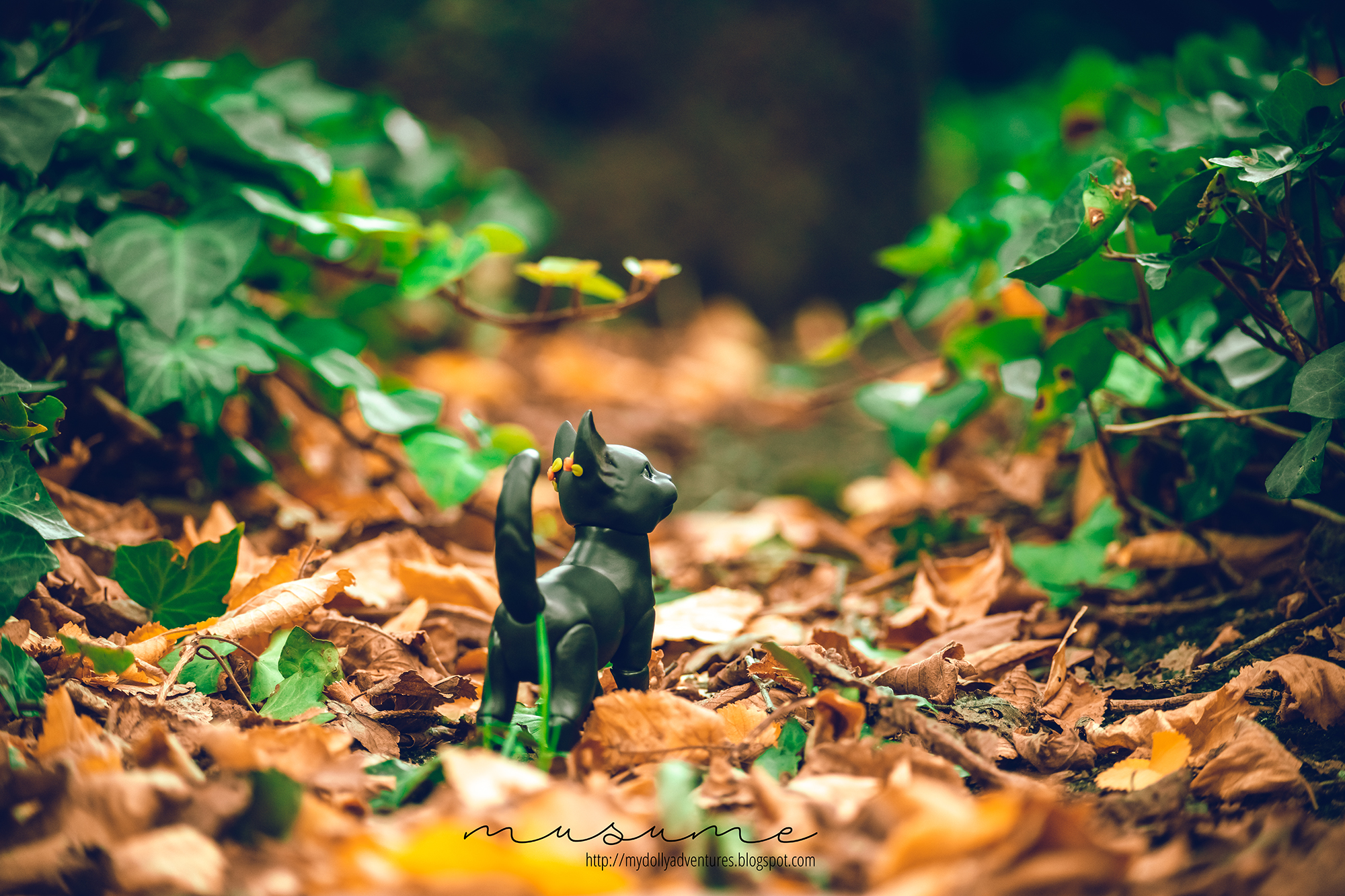
So I took both photos here with one of my fave vintage lenses, a Carl Zeiss Jenna 100-300 f4.5-5.5 from 1962. Yup, 1962, and in a very modern camera. Shoot me, I like vintage lenses.
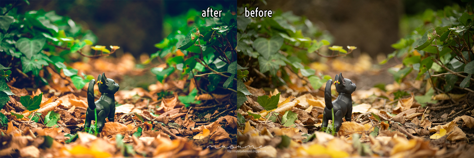
Anyways, below is the original and the edited version. As you can see, the colours are quite off, right? What I did was basically tinker with the calibration, to enhace some colours and mute others. However, I edited this one using a preset, which is a prefix, pre-recorded, set of configurations that you apply (quite literally) with a single click. So this is a great way to start if you don't know how to. What you need to do is Google for "lightroom presents" or "Photoshop actions" and you will get some that are free and others that you must pay for.
Now, this is the other photo. I have a lot to share on this one. Let's look at the finished photo first:
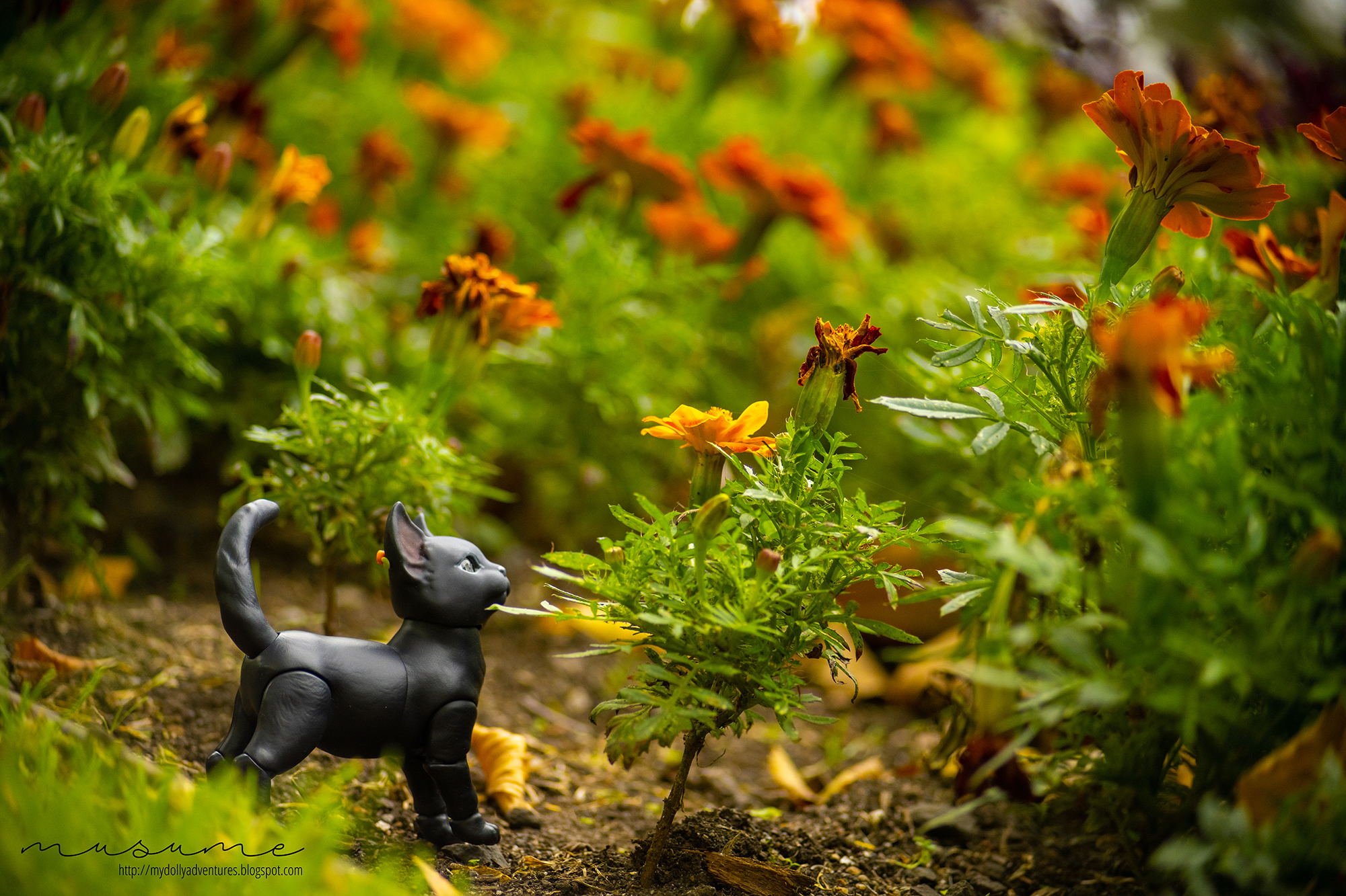
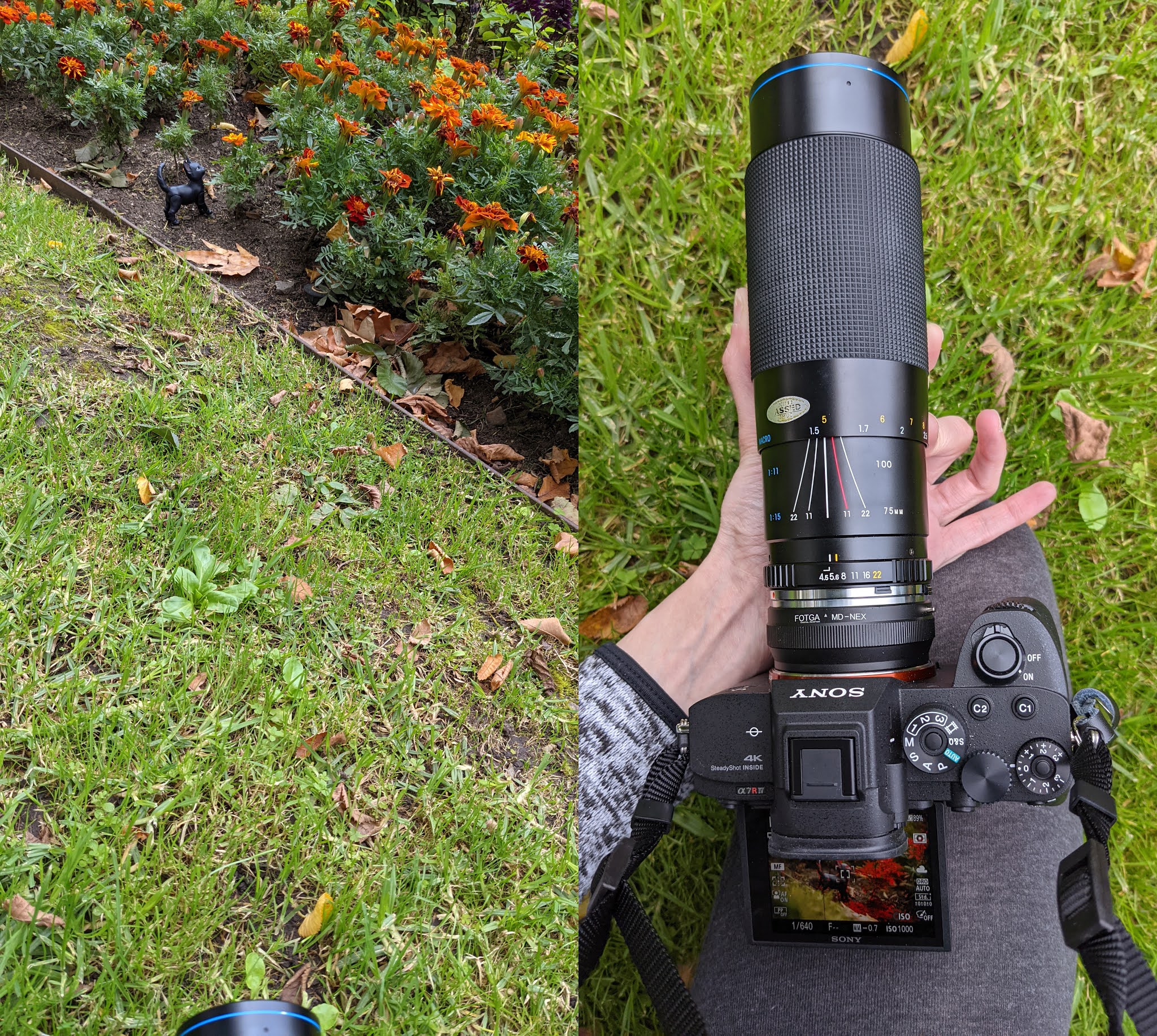
So first of all, it was a large group of flowers, and I was using the inclination of the ground to shot this in an angle that seemed from the ground up. I also twisted the angle of the photo because I like negative space and wanted the constrast of the orange flowers with the green. So here below you have the lens and the distance I was (about 1.5 meters). Also, if you watch the lens, you can figure out the setting: 125, f4.5, at about 155 centimeters of distance to the target.
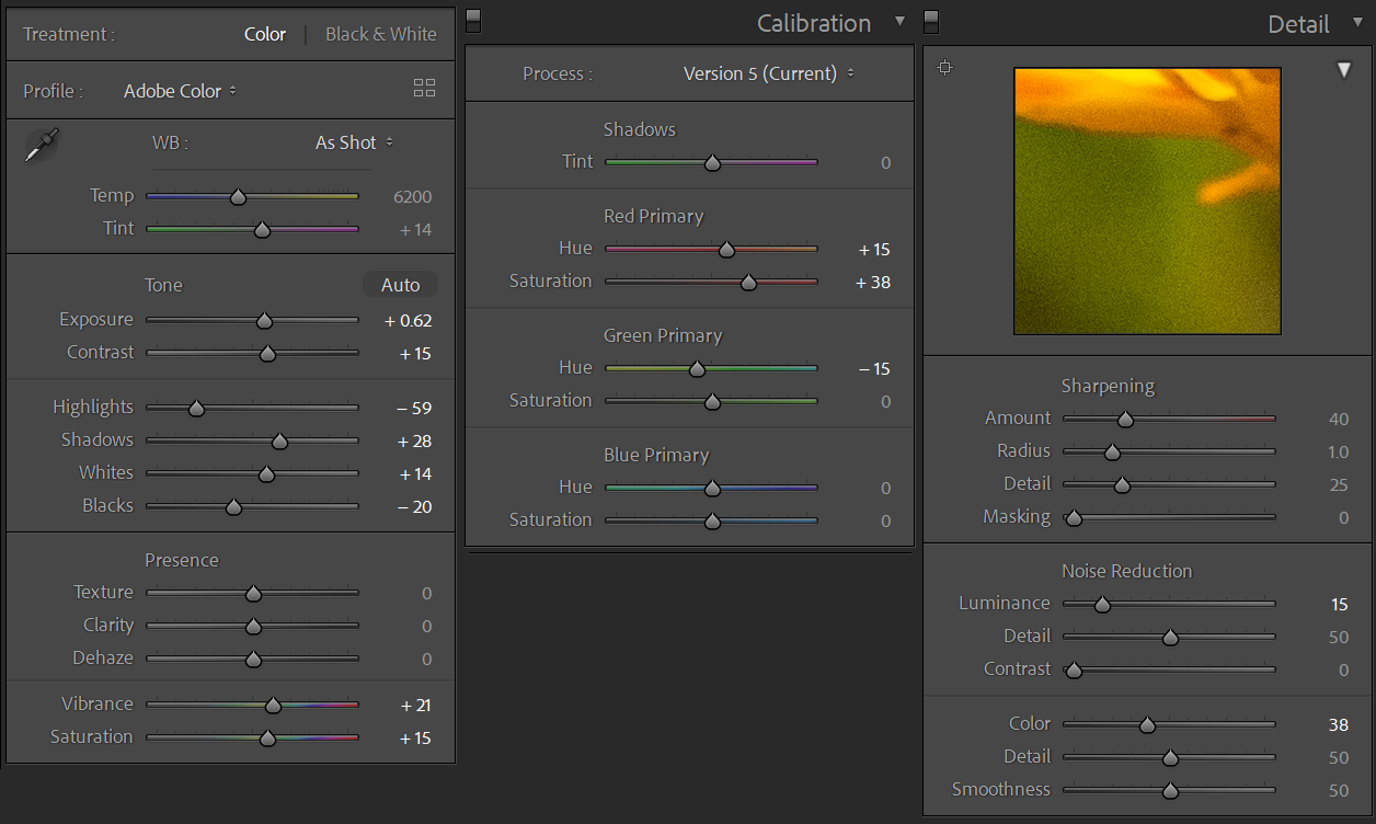
Now that we have that, time for editing! I shoot RAW (that's the format on the camera) so I can make more detailed edits than with a JPG. Because I shoot RAW I edited in Lightroom, but you can replicate these in Photoshop. So first of all:
- Exposure and Contrast allows you to basically compensate for lack of light in the photo, while making the colours a bit more vibrant. Be careful, because you can wash out the whole photo like this.
- Highlights and Shadows tinker exactly with that--the lighter and darker colours of your photo, so you can control how dark a shadow actually is. Likewise, Whites and Blacks while make the whites more whites or grays, or the blacks more black o more gray.
- Curves are also a great tool, but I didn't touch them on this photo.
- Details is basically to compensate for the ISO. Remember my tutorial? A higher ISO makes your photo "noisy". Pay attention to the ultra macro that you see on the setting, and you'll see that there are, well, grains. That's the ISO noise. With the Sharpening section you make the photo more sharp at the cost of noise, and with Noise Reduction to make it more blurry to remove the grain. I was trying to compensate that here.
- Calibration is one of the sections that allows you to tinker with RGB (red-green-blue). And for each colour you control the hue and the saturation (how greyish-bright the colour is). This is up to you, but those are the settings I used on this photo.
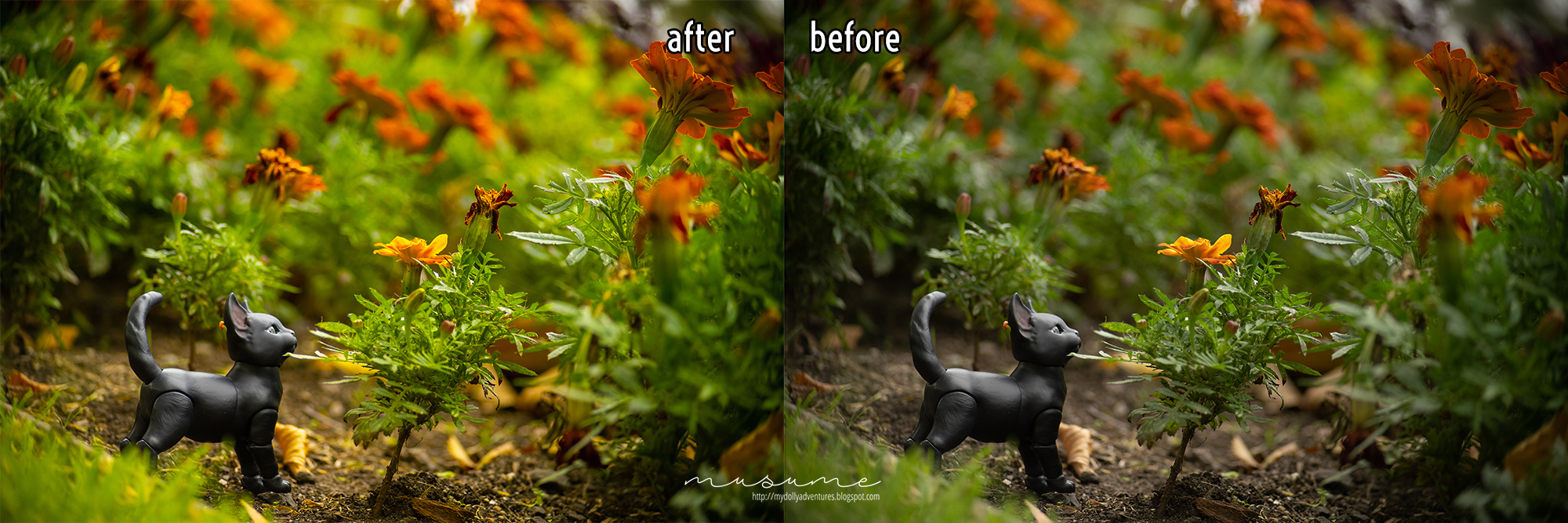
Okay so that was it! So you see that, yes, there was a predominance of green on the photo, but I enhanced it like waaaay too much, reinforcing the orange as well. I know this was a very, very quick explanation, but oh well. I hope this was helpful and fun!


Oh, wow that is one huge lens! Beautiful photos and very interesting to read about your way to edit the photos. There is so much you can do with different changes, I am amazed. Learned some more today! :)
ReplyDeleteIt is! Fully extended is *huge*. Happy you liked the edit, I shall do more, then!
Delete