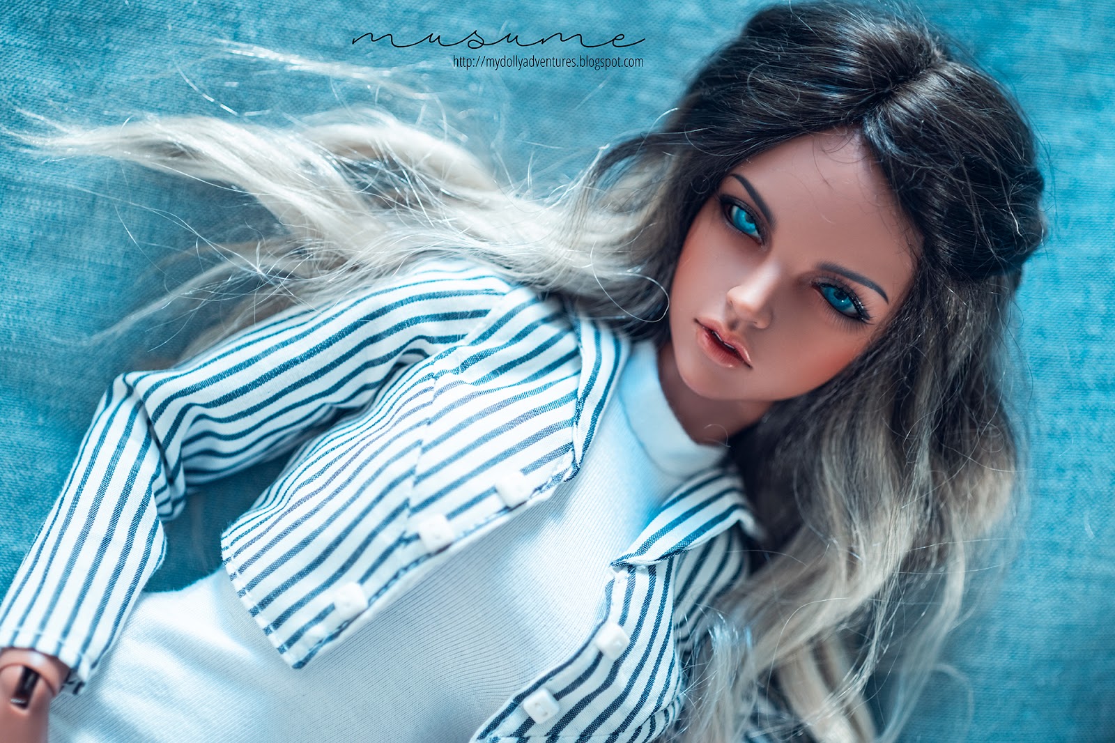


So, basically what I did for the editing was the following. After regular exposure/contrast, cleaning noise and so on, I lowered the warmth so it would be cool (kind of like you have cool lights in your house). Then, changed the tint on the deeps and brights towards a more cerulean shade, and increased the brightness so the colours would "pop up". You can see the before and after here... quite different, right?

You can see the goal I had was to "match" her eyes to the coverlet I used as background. But that's all! Basically, shitty photos that I think turned half-way decent thanks to the extreme, colourful edits. I regret nothing! Ha!


You should not regret anything with these photos! Far from shitty - love the edits and her eyes really pop!
ReplyDeleteOhhh, thank you!! Happy you like them--the eyes do really pop out!
Delete